Managing data just keeps getting tougher. The more we think we’ve gotten a handle on our data the more it grows and becomes too large for our existing analyses.
This issue became very clear to me after I undertook the task of trying to understand the effectiveness of ad campaigns using SiteCatalyst weblogs. Seeing as I’d analyzed weblogs before I didn’t think this would be much of an issue. The twist: the weblogs contained over 2 Billion rows!
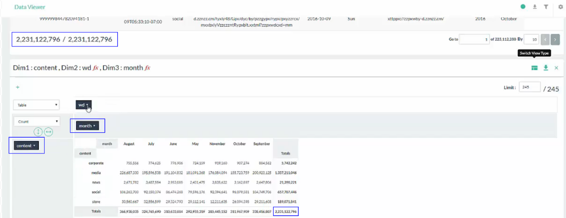
Pivot Billions is ideal to analyze the data due to its scalability to handle massive datasets. Taking the over 2 Billion rows of data, Pivot Billions loaded them into 500 Amazon c4.large instances in a matter of minutes. Then I started to explore the data using Pivot Billions’ reorganization and transformation features. I was mainly interested in how the ad campaigns had worked throughout the data so I used Pivot Billions’ column creation function to quickly extract the month and weekday from my date column (took about 4 seconds). Then I did my first pivot.
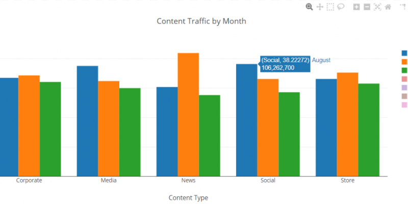
All of my data was rearranged into a view by content type, month, and weekday. I was now able to interactively explore the distribution of my data by each of the combinations of these features. I wanted a quick overview of how each of the content types drove traffic each month so I viewed the content and month columns’ data as a Table in Pivot Billions’ PivotView.
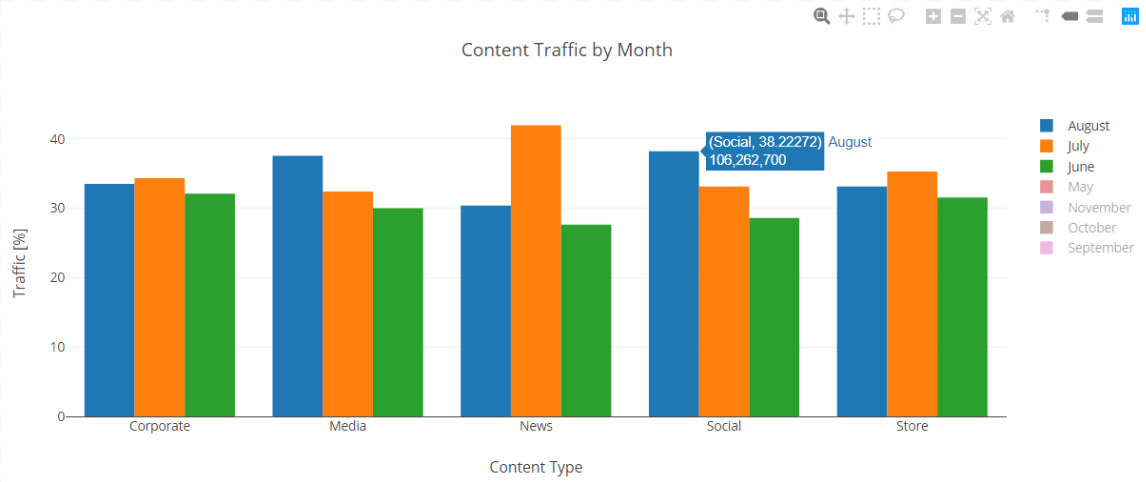
This was a nice summary of my data but I wanted a more visual representation. I viewed the data as a Bar Graph so I could compare the content types and months more easily.
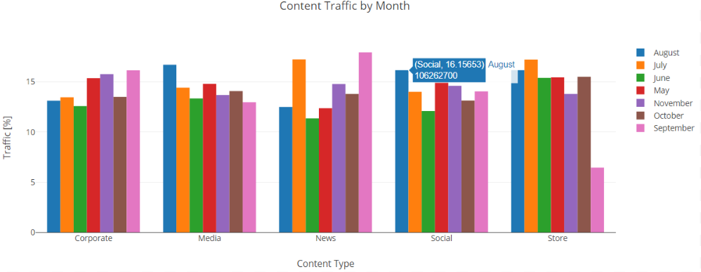
From this overview it appears that the traffic to the site experienced a significant jump during August for the Social and Media content categories. Focusing on the summer months, we can more clearly see the effect.
The Media and Social content categories saw an average 6% jump in traffic in August over the summer months. Seeing as these categories were already by far the best traffic generators this was pretty impressive.
Now I wanted to understand what caused this jump (and hopefully how to repeat it). My first guess was that this jump could correspond to the End-of-the-Summer campaign that was running at the start of each week (Monday) in August so I decided to dive a little deeper. By now viewing the data as a Table Barchart in Pivot Billions’ PivotView, dragging the weekday feature into my PivotView, and deselecting the other days of the week from the weekday feature, I was able to quickly visualize my data’s month-to-month Monday traffic.
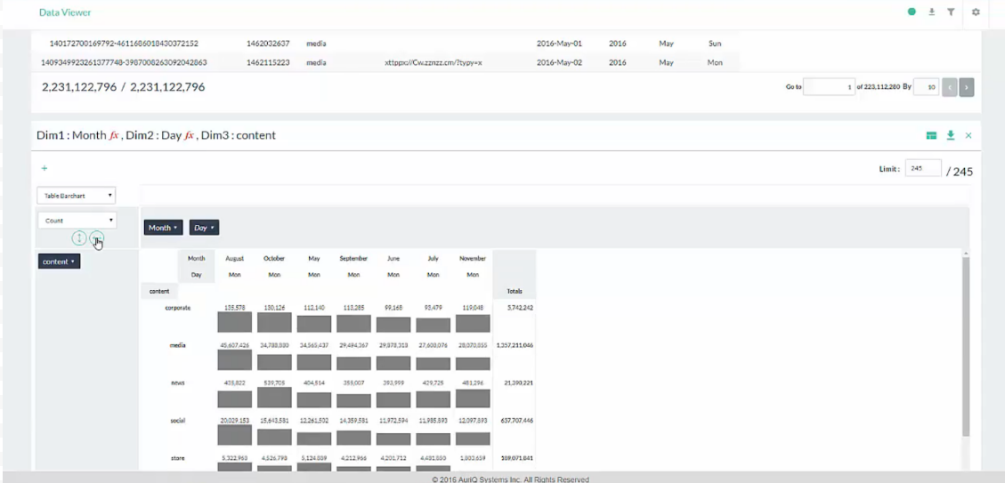
Mondays in August did indeed see a large increase in Social and Media traffic, approximately 50% of the total August jump. This made it more likely that the End-of-Summer ad campaign was at least partially responsible for the increased traffic but I wanted a more complete view. After re-selecting the other days of the week I was able to see a more detailed view of how the ad campaign tracked with potential customers throughout the week.
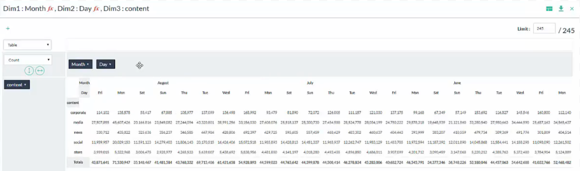
It was now clear that the traffic had a very noticeable spike from social and media sources on Mondays in August, followed by high but declining traffic on Tuesdays and Wednesdays. This was not seen earlier in the summer since the campaign had not started. It is reasonable to conclude that the End-of-Summer ad campaign had a significant effect on social and media traffic.
This is already fairly useful information but really I’d like to drill down into the ad campaign and see which sites were driving the most traffic. I quickly pivoted my data again, this time by protocol/domain and month so I could get a closer view. Viewing the pivoted data as a Table Barchart again and sorting the data so the sites and months with the highest traffic were at the top and at the right, I was able get a detailed look at the best performing sites and which of them had the highest impact from the ad campaign.
Note: The protocol/domain data has been anonymized for this post.
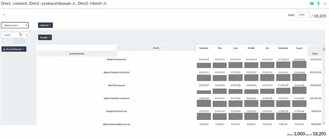
It’s clear that some sites had much higher impacts from the ad campaign than others. Even amongst the five highest performing sites, two weren’t affected by the ad campaign, one had a moderate improvement, and two others had sizable increases. The highest performing site saw an over 17% increase in traffic from the ad campaign and the third highest performing site saw a nearly 50% gain! Now that I know the types of ad campaigns that are most effective and have a full list of sites that they are most effective on, this analysis will be helpful in improving the ROI of future ad campaigns and making sure the investments are spent in the right places.