
The age of data has arrived. With it, more and more datasets are created and they just keep getting bigger. Whether dealing with private or open data, individuals and organizations across the world are realizing that there are enormous amounts of information and insights to be gained from massive data.
The public NYC Taxi and Limousine Commission Trip Record Data is a good example of an ever growing massive dataset. Pivot Billions is ideal for analyzing this type of data due to its ability to scale to handle any size of data.
In order to explore passenger and taxi trends over the years, I used Pivot Billions to process more than 200 compressed csv files to load 1.5 Billion rows of data into 170 Amazon c4.large instances in 3 minutes. Now that the data was loaded, I explored the data using Pivot Billions’ reorganization and transformation features. One thing I noticed right away is the data had tip and total taxi cost as separate columns. It’s more useful to compare percentages so I created a new tip percent metric from those columns using Pivot Billions’ column creation function (took about 4 seconds). Another messy data property I noticed was overlapping payment type codes. As seen in the following column distribution, the codes were modified over the years. In some years they used the complete spelling, others they abbreviated and more recently they began to use numeric values.
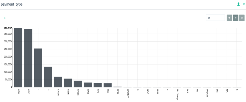
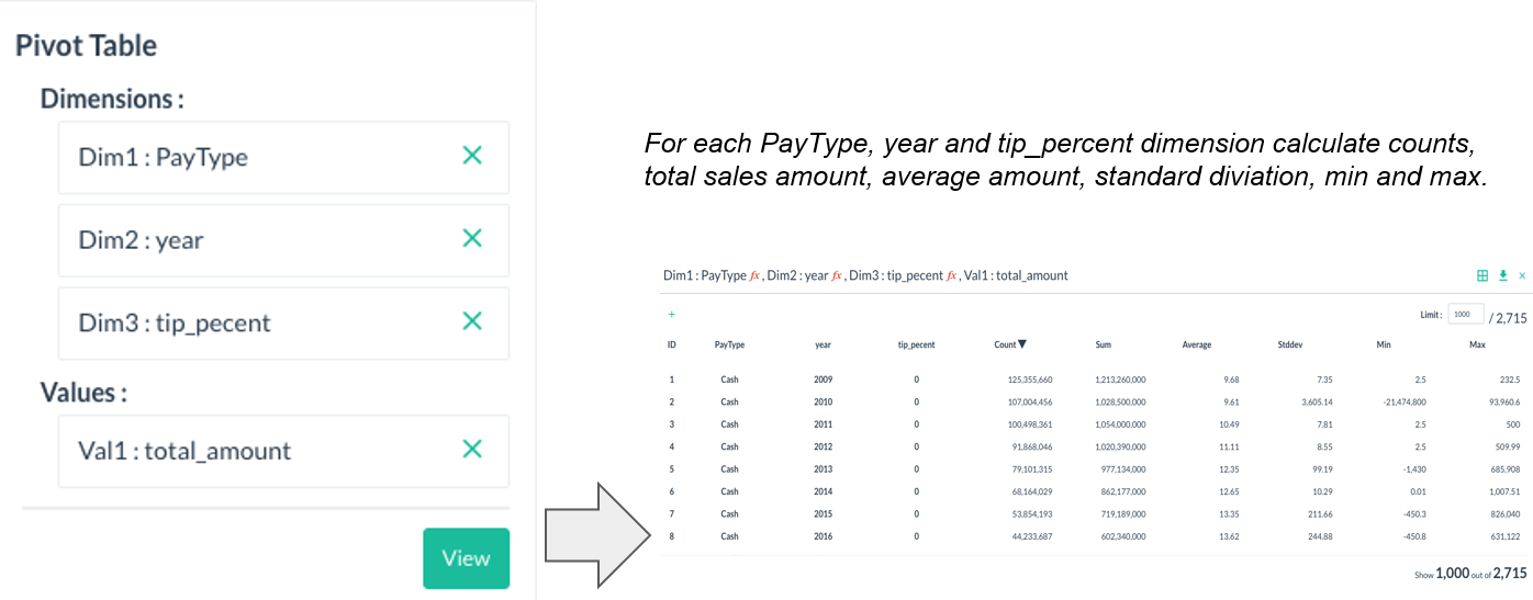
I quickly applied a lookup table in Pivot Billions to create a new, cleaner transformed column called PayType. Now that my data was clean and enhanced enough to draw some meaningful insights, I simply pivoted my data to get the number of taxi trips and taxi payment statistics by PayType, year, and tip_percent.
By entering Pivot Billions’ PivotView, I visualized the data using a heatmap to compare the distribution of tips for cash and credit card passengers.
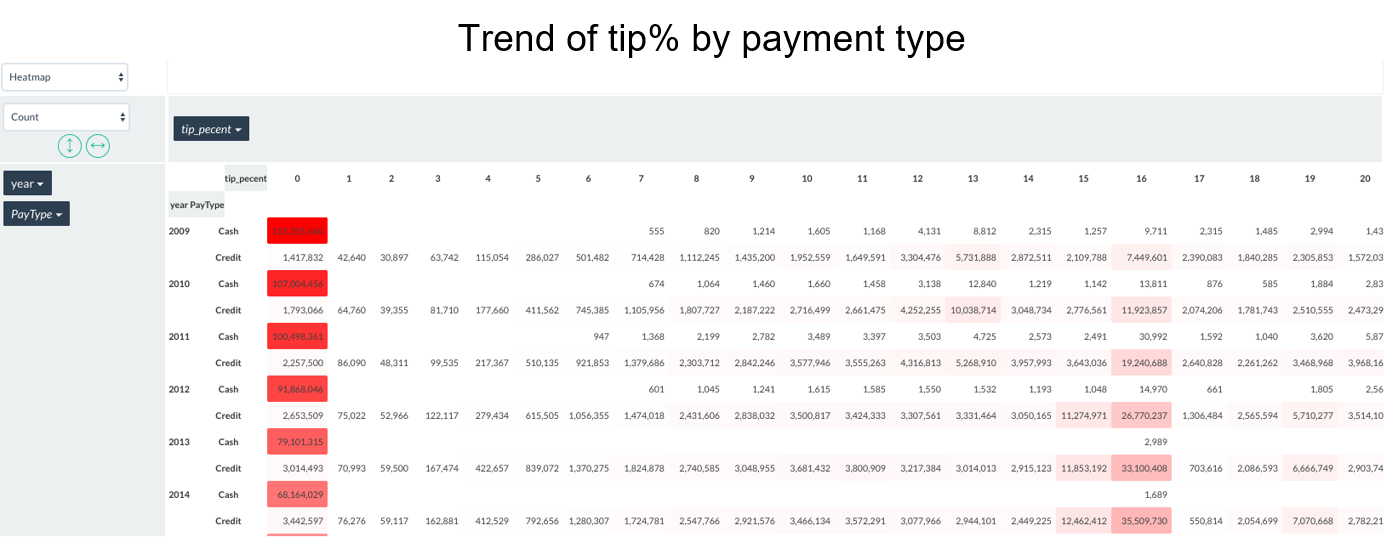
It was immediately clear that people paying in cash generally did not pay a tip or, more likely, the driver did not report a tip. However, credit card users typically paid ~16% tip, possibly due to the ease of the taxis’ touch panel payment system for credit card users.
Now that I understood a bit more about passenger and taxi tip behavior I wanted to see if I could find any other trends underlying the data. Quickly pivoting the data again to view the number of trips and trip distance statistics by year and month, I started to draw some new insights. By visualizing the data as a LineChart in PivotView and comparing the total trip distances by year to the average trip distances by year, I noticed an interesting discrepancy.
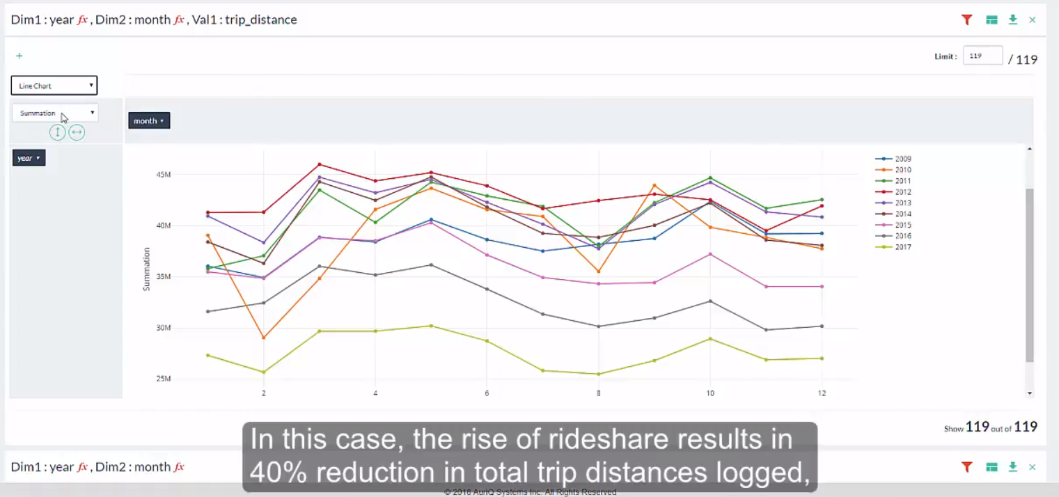
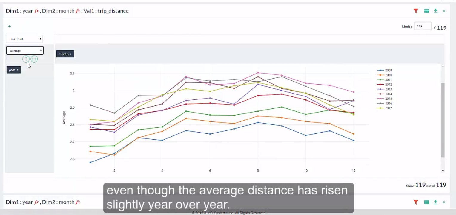
Though the total trip distances were decreasing year over year, the average distances were rising slightly. The growing popularity of ridesharing in recent years is likely responsible for this trend, a nearly 40% reduction in total trip distances logged from 2009 to 2017.
By incorporating the rideshare data from the NYC Taxi and Limousine Commission Trip Record Data , and doing a quick comparison of total 2015 -2018 trips in the months of January, it shows a pretty remarkable shift in the riding habits in NYC.
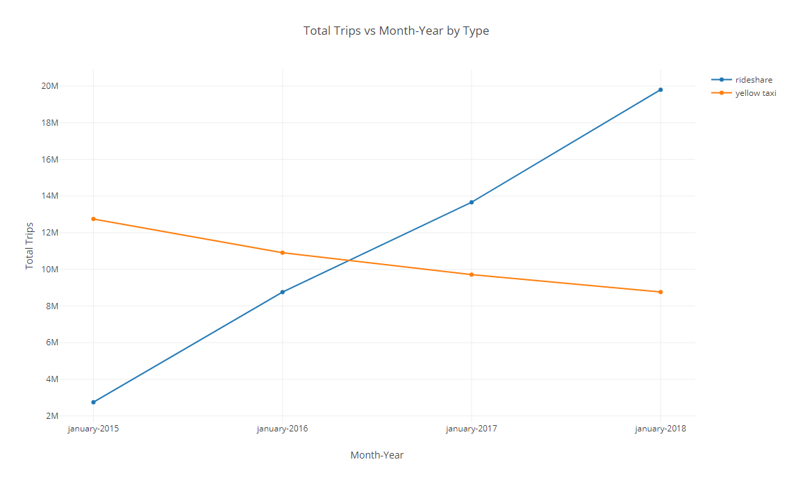
This chart seems to validate the underlying trend surmised in the prior analysis, that rideshare growth has eroded yellow taxi ridership by nearly 40%.
Diving into large datasets like these can be a challenge and incredibly time consuming, but with PivotBillions, it just takes a few minutes from start to finish.